2015
Creative Direction | Branding |Digital Design | Print Design | Visual Identity
Fastfilmz - the brand story
Fastfilmz, The brand
Fastfilmz, operating in the Video on Demand market, is seeking to push the boundaries of the way India’s 250m smartphone users watch movies. fastfilmz has the exclusive India license for internationally acclaimed, proven & patented video compression technology: V-Nova’s PerseusTM. Giving, for the first time, fast and uninterrupted HD video streaming and downloading to the 80% of India’s urban population living in tier 2/3 cities. With an exciting proposition for Regional India, fastfilmz is all set to make deep inroads into the hearts and minds of this movie crazy population.
My role
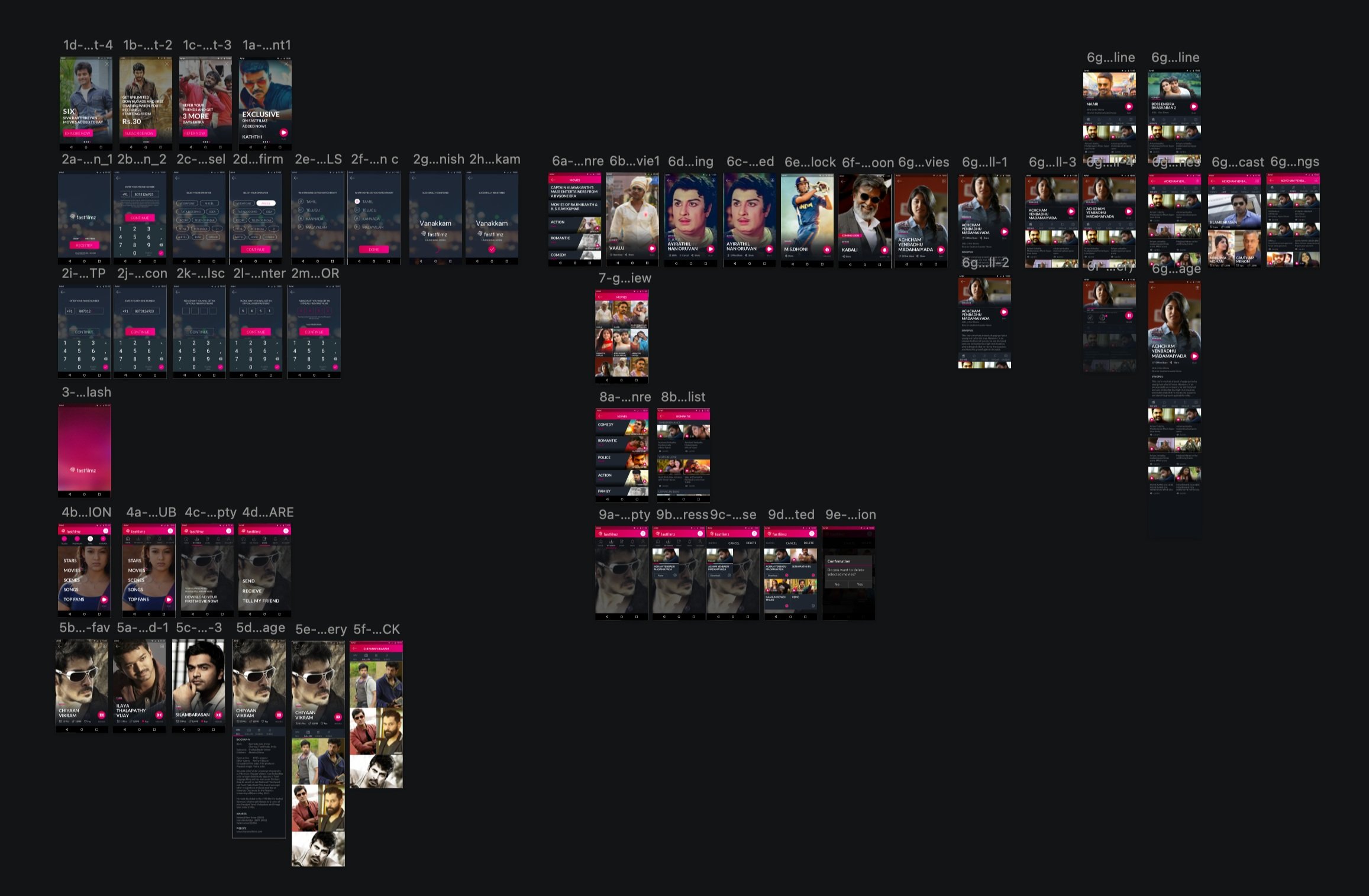
As the Design Lead, I worked closely with my Design Director at fastfilmz, an ambitious startup aiming to revolutionise India's video streaming industry. Our main goal was to develop innovative branding and marketing strategies. We spent numerous brainstorming sessions refining ideas for marketing campaigns and app design.
My first focus was to create a brand identity that reflected in the dynamic essence and diverse content offerings of Fastfilmz's Android and iOS apps, but also symbolised its commitment to providing a unique viewing experience to India's smartphone users, especially those in tier 2/3 cities.
My Inspirations
Inspired by fastfilmz's emphasis on regional Indian cinema, particularly from South India—a culture I intimately resonate with—I embarked on a quest for inspiration. Hailing from the same region, I could vividly recall the vibrant tapestry of our movie culture: the fervent celebrations, the kaleidoscope of colours, and the glorified hero worship that defines our movie fandom. Drawing from these rich cultural experiences, I aimed to infuse the design with the essence of our collective passion for cinema, ensuring it resonated deeply with our audience's sensibilities
FastFilmz is an innovative app that has revolutionized video streaming for the 70% of smartphone users in India who rely on 2G and 3G networks. With its patented technology, FastFilmz enables users to stream HD videos seamlessly without buffering, even on slower networks. The app's name reflects its core mission: delivering fast, high-quality film streaming to smartphones under challenging bandwidth conditions.
Immediately, I knew that I needed to embrace speed, and local colourfulness, especially the vibrant and multicultural regional South India, with its glorified stars worshipped by fans. so I started sketching on paper, creating vectors in Illustrator, whatever came s to my mind, filmstrip to play button, cheetah to arrows…
Fast + Colorful + Local
I started like this
The Spintop Aka Pamparam
Suddenly I found my gem: the spintop, also known as Pambaram, a colourful wooden toy that brought endless joy to my friends and me back in the 90s.
I was spinning with happiness as I envisioned the perfect logo that would culturally resonate and meet the organisational needs. The spintop's nostalgic charm and cultural significance stood out, inspiring and compelling me to pursue this concept. Fueled by this inspiration, I eagerly sketched different shapes and forms to bring my vision to life. Each sketch brought me closer to my goal, making the dream of a fitting and meaningful logo increasingly tangible.
Iterations before the final
I picked a medium violet-red as our brand colour, inspired by and tweaked from the vadamalli (Gomphrena Globosa or Globe Amaranth) flower, which is common in our area. The vadamalli flower is beautiful in purple, white, and red. It is mainly used for stage decorations during celebrations like marriages.
The spin top symbolises motion, agility, gaming, fun, and togetherness. We've carefully chosen the colours of the spin top to reflect the diversity and energy of the Fastfilmz catalogue. Starting with our brand colour at the top, the colours gradually span the visible spectrum of light, ending at the invisible blue ground below. The bold and block fonts represent the boldness of our brand and its strong presence.
Ad Campaigns
TVC- 2015
After a year, we revamped the original app with a more modern and sleek design. Our aim was to achieve a more contemporary and streamlined aesthetic in line with current design trends and user preferences. We also improved the user experience, added more features, languages, and content to enhance the overall functionality and appeal of the app. Additionally,
We slightly enhanced our app's logo by using a thinner font to complement the updated design, creating a more elegant look and feel.


